


The Interactive Timeline Business Data Visualization for Microsoft Dynamics NAV provides a unique view on business data with an interactive user interface (UI) to change the business data. It targets the class of business data that represents a series of changes that measures value over time, such as:
-
The future inventory level of an item from known and expected supply and demand events.
-
The balance of an account over time, as influenced by the account-related transactions.
The visualization helps identify periods of time during which the value falls under zero. You can add multiple horizontal target lines to the visualization for additional visual comparison with target levels. You can also visually mark special dates, such as today, or a work date.
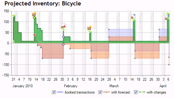
Visualization lets you compare multiple what-if scenarios, for example, by taking a certain forecast into consideration.
Visualization also includes an interactivity option. Interactivity allows a user to change the amount and date of a transaction directly in the visualization by dragging the visual point of a transaction to the new amount or new date. The changed transaction will be tagged visually with the nature of the changes. The projected result of the change will be shown immediately.
Characteristics of the Business Data Visualization
The Interactive Timeline Business Data Visualization provides a visual representation of the data that is transformed into a mental model. This lets users understand the influence of transactions over time, on a certain measure. The visualization provides insight into business transactions by displaying the projected aggregated consequences over time. It visually highlights problematic situations, such as time periods and amounts that go under zero. Optionally, it provides visual comparisons of defined amounts throughout the time period.
The visualization provides interactive access to amounts and schedule of transactions in the graphical presentation. It also lets you create new transactions and delete existing transactions. The visualization shows the projected consequences on the observed measure when you modify the transactions in the visualization, before the changes have been posted to the business logic.
The business data visualizations are characterized by the following pillars.
| Pillar | Description |
|---|---|
Picture the business (delivers mental models) | Visualizations provide a mental model for business data and data dependencies. By seeing a visual representation of data and dependencies, even non-expert users can more easily understand business data. |
Understand the business; know state and trends (provides insight) | Visualizations are an entry point for understanding the current state of a business and trends. Users can drill down and filter data to provide intuitive, ad hoc analysis. |
Know how to act (identifies actionable items and tasks) | Users can use business data to find items of interest and outliers that are based on certain objectives or measures. The outliers can be converted into high-priority actionable tasks and possible actions. |
Act wisely (provides decision support, problem solvers, and optimization) | Problem solvers and optimizers help users decide on a strategy. They can provide suggestions for an action strategy that could lead to an optimal result for one or more objectives. |
Understand consequences (visualizes consequences before acting) | Visualizations help users to understand the effect of actions before they are committed. Visualizers can explain dependencies, predict the outcome of actions, and provide visualizations to users. |